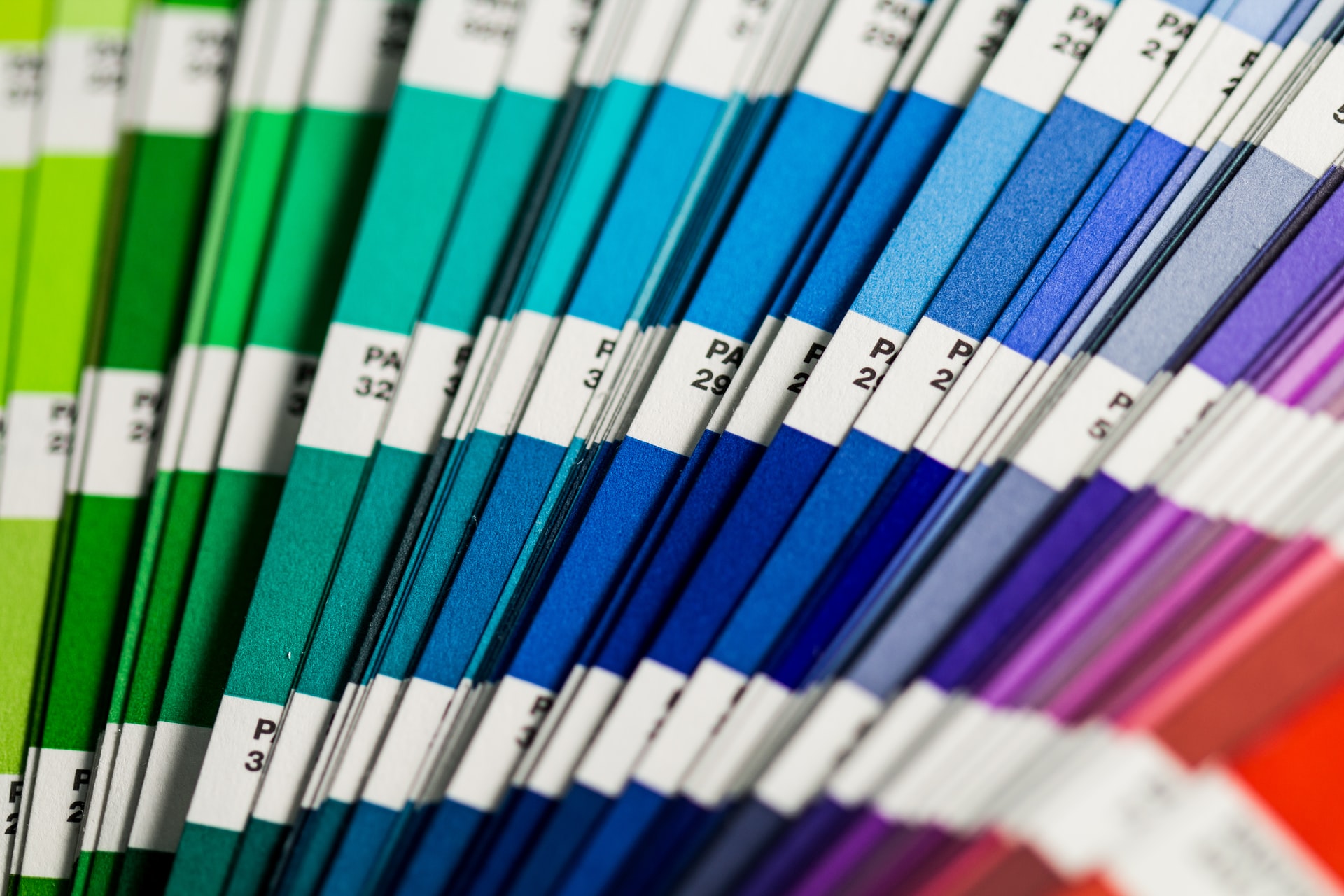
Pantone provides a universal and globally available language of colour that can be used as a guide for brands and manufacturers to make colour decisions. Millions of designers and producers around the world rely on Pantone when it comes to colour selection. Each Pantone colour has a unique code that enables users to identify the exact shade they require ensuring there is no miscommunication when it comes to colour use.
Pantone has two colour systems, the Pantone Matching System (PMS) and the Pantone Fashion, Home + Interiors System (FHI). Each of these systems is designed to cater to relevant markets and materials.
The Pantone Matching System is more suited to graphics for printing, packaging, digital applications and screen printing.
The Fashion, Home and Interiors System is suited for textiles and coatings and pigments. Therefore, you would use the FHI for apparel, fabrics, soft goods, cosmetics, paints, leather and accessories.
Pantone Colour of the Year
Each year, Pantone releases a new colour. The selection process for Pantone Colour of the Year includes careful consideration and trend analysis. Pantone’s colour experts search globally for new colour influences including the entertainment industry and films in production, travelling art collections, new artists, fashion, popular travel destinations, design and technology.
And the Pantone Colour of 2022 is … Very Peri
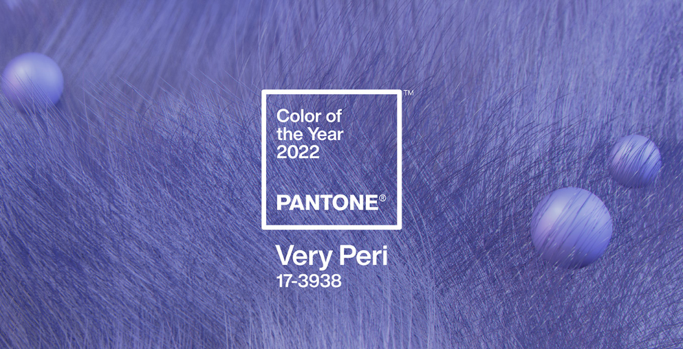
Very Peri (PANTONE 17-3938) is the 2022 Pantone Colour of the Year. It’s a symbol of the global spirit of the moment and the transition the world is going through. Emerging through intense periods of isolation, ideas and standards are changing and our physical and digital worlds are merging. Influenced by trends in gaming, the popularity of the metaverse and the rise of the artistic community in the digital space, Very Peri reflects the fusion of modern life with colour trends of the digital world.
To learn more about the latest colour trends speak with the team at Lateral Building Design.