White is white, can’t go wrong, right? Choosing the right white can be challenging. The myriad of whites can get quite overwhelming if you can’t quite distinguish the subtle differences between all your options.
Vivid White, for example, has no tint, so it is white in its purest form, which is why it is a common colour for ceilings as it won’t compete with your walls or trim. Lexicon, on the other hand, is certainly a white however has a single drop of black tint, which gives a blue undertone.
It can seem complicated but there’s no need to feel overwhelmed when you have the team at Lateral Building Design in your court. Working with their clients, they will wade through the sea of white and find that one perfect shade. Read on for a word from our team.
The benefits of a white room
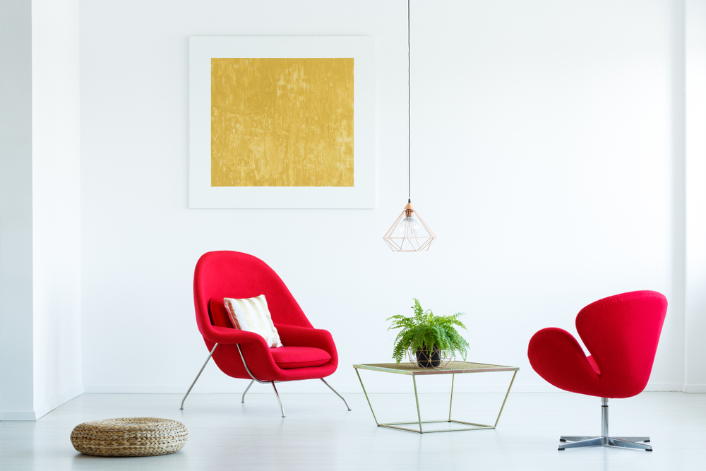
A white room can help a person sleep better and can also help a property sell faster, as a blank white canvas almost always looks better in photos and online, and it’s easier to coordinate furniture. White contains an equal balance of all colours on the colour spectrum, so this versatile colour symbolises completion and wholeness.
White reflects light and creates an illusion of space, making a room appear bigger and brighter. White goes everything, but out of all the whites on offer there is one key question that all designers will ask: warm white, or cool white?
Whites to warm your soul
Warm whites are preferred by interior designers as it is much softer on the eyes and provides your home with a cosy and relaxed feel. However, if you go too warm, there is a risk of making your home lean towards the yellow hues.
Our all-time favourite warm white is a Dulux shade called Natural White. This white is incredibly versatile, suiting many different lighting situations, styles of home and applications (walls, trim, cabinetry, etc).
Natural White is the lightest of the warm whites range at Dulux and has an ochre undertone to it. The little black tint in this colour takes the yellow out of it, making this a great all-round colour for your home. It lifts without hiding architectural features, suits both beige and grey walls and is a great base for art works as it suits all bright and muted colours.
If you feel Natural White is still a little too warm for your taste, we recommend something like Dulux White Exchange at quarter strength. This white is similar in makeup, however with a little less ochre and a little more black. This is probably a white that is suited to modern homes as it is crisp, while still providing that soft warmth we love.
Other warm whites with a little more colour that we love and work beautifully on walls, in any strength, are Dulux colours Hog Bristle, Stowe White, Feather Soft and China White.
When to keep it cool
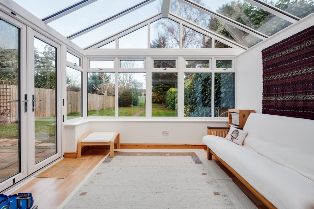
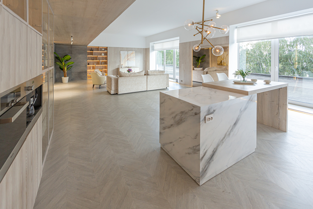
Colours with cool undertones are crisp and modern, however can be tricky to place. Cool whites are clean, energising, bold, and pair great with natural timber, exposed brick, or polished concrete floors. Colours such as Dulux White on White and Lexicon are quite popular in publications. While aesthetically pleasing in a space don’t be fooled by fancy magazines and expensive décor – rose-coloured glasses can be potentially risky, so be mindful when using cool whites in your home.
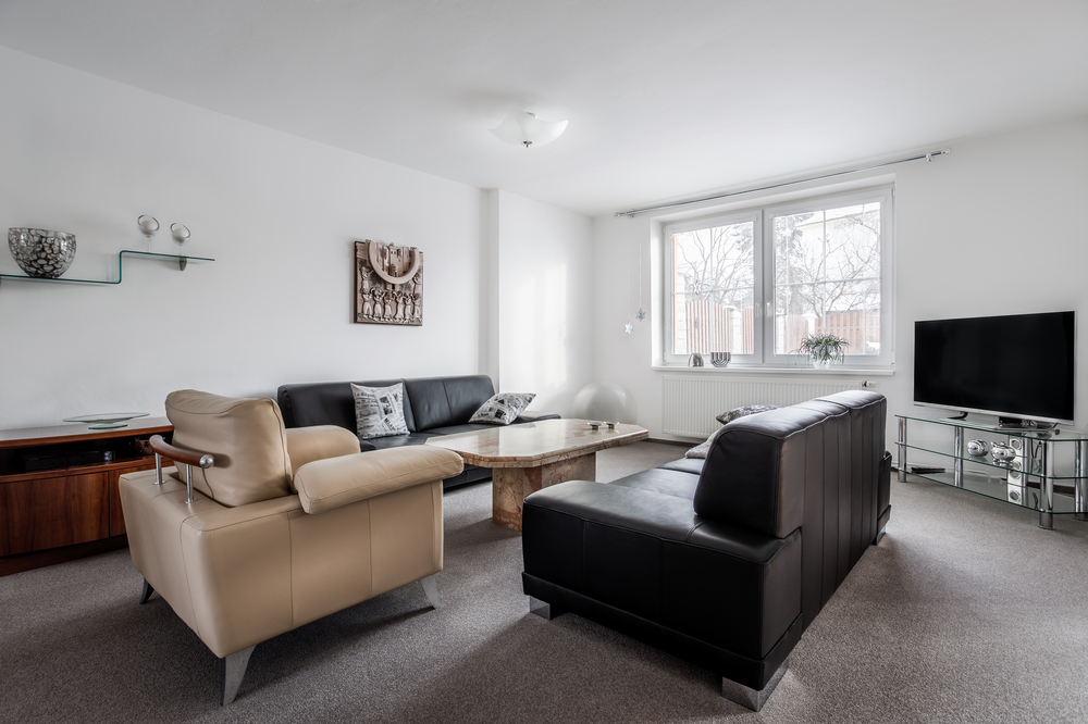
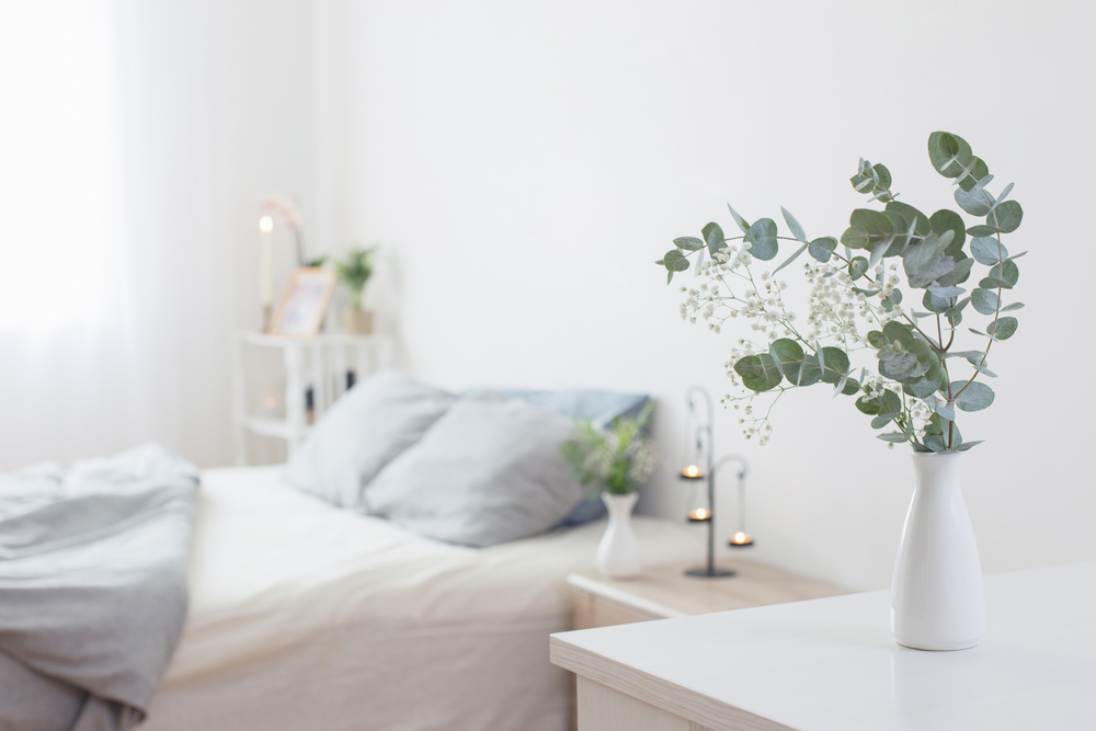
Whites, as mentioned above, or White Exchange Half, are better in living rooms where there is a lot of natural light, as they tend to neutralise bright light. Low light rooms, such as bedrooms, seem to accentuate the blue undertones and make the room look a bit clinical – not exactly the cosy ambiance one desires in a bedroom.
If you are opting for a cooler white for your walls, it can be a good idea to put the same or similar white on the ceiling and trim. This takes the initial sharpness out of the colour and will make it look less blue. This also means there is nothing contrasting or competing with it, ensuring you are not distracted by any of the undertones and can appreciate the colour to its fullest extent.
Don’t underestimate the power of the perfect white. Warm whites can be quite forgiving, cool whites need a bit of thought, but as with any colour if you really don’t like it, you can always paint over it.
The team at Lateral Building Design can advise you, provide designs, and documentation for your next project! Contact us on 9729 4973 to find out more.